It's no secret that executives crave visibility. And all too often, on your mission to keep reporting and executive summary dashboards clean and concise, even the best-intentioned dashboards can become cluttered, overwhelming, and tedious. The process of maintaining the dashboards populated with accurate information is just as important as the dashboards themselves and especially difficult if you're trying to do them in spreadsheets.
In this guide, you will learn:
- Five common mistakes to avoid when creating data visualizations
- Best practices for designing executive summary dashboards
- Tips for leveraging technology to create, track, and update your dashboards in real-time
Data visualization is probably one of the most misused and misunderstood forms of communication in the business world today. Slick and stunning data visualizations are useless if they aren’t used effectively, accurately, and in a highly deliberate manner. Good data visualization certainly does not happen by accident, and when people think their existing dashboards are missing the mark, the problem is often related to some misunderstanding of how data visualization is supposed to work.
Choosing the Wrong Media to Display Your Data
This common dashboard design mistake takes two forms. The first is using a graph when a table of numbers would work better and vice versa. The second is using the wrong type of graph for the data and the message it is trying to convey. For instance, a pie chart is best used when trying to compare parts of a whole, yet we often see side-by-side pie charts that display the same data at different points in time – which is better suited to a bar chart. If the slices of the pie cannot be interpreted in a useful way without reading the associated numbers, then what use is the picture?
Introducing Meaningless Variety
This mistake is closely tied to the one above. Oftentimes, dashboard designers select an inappropriate chart or graph simply because they are trying to introduce graphic variety into the dashboard. A bar chart may already have been used several times, and, even though the new metric may be best served by another bar chart, a pie chart is selected just to create visual distinctiveness. You should always select the means of display that works best, even if it results in a dashboard filled with nothing but multiple instances of the same type of graph. If you are giving viewers the information they desperately need to do their jobs, then the data won’t bore them if it’s all displayed in the same way. Alternatively, they will definitely get aggravated if you force them to work harder than necessary to get the information they need because of unnecessary variety.

Over-Designed Charts and Graphs
Give people access to 3D effects, shadows, and unlimited colors, and they will design dashboards that run amok. Simple is always better. If the design of your dashboard becomes the focal point – rather than the information contained within the dashboard itself – then you are on the road to failure. Rotating charts and graphs on their axes, adding special effects, and choosing overly bright colors usually do nothing to make dashboards easier to read.
Ineffectively Highlighting What’s Important
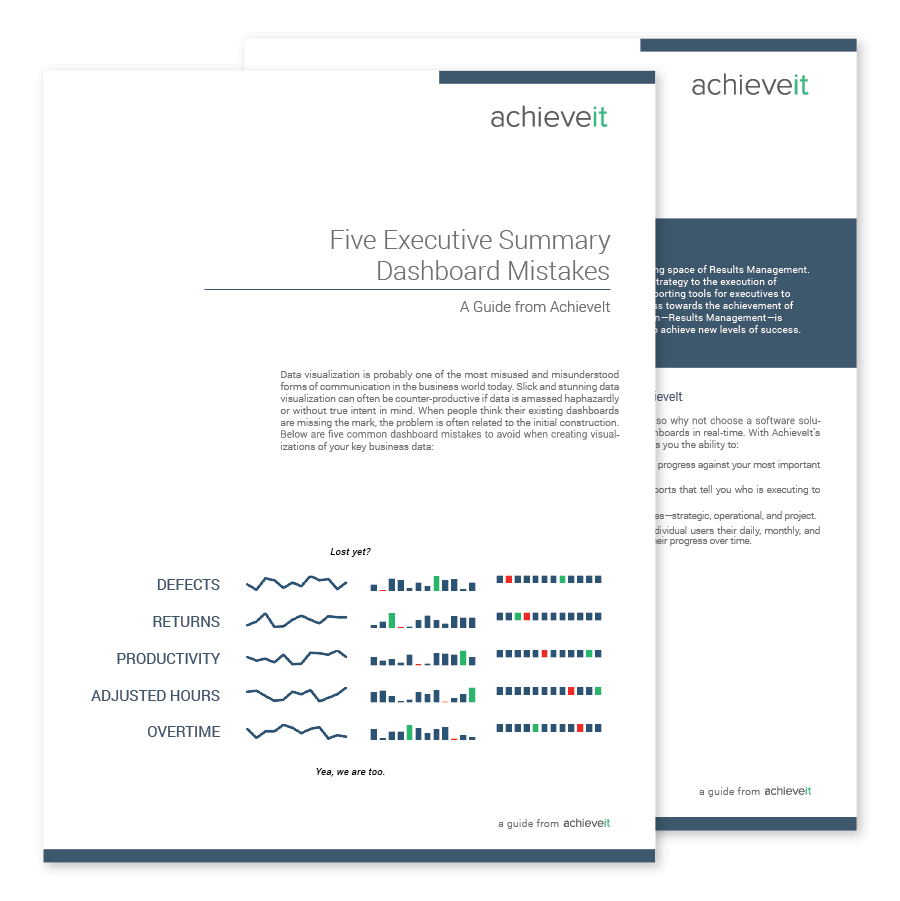
You should be able to look at a dashboard and have your eyes immediately drawn to the mostimportant information. When everything is visually prominent, nothing stands out. All of the data displayed on a dashboard ought to be important, but not all data is equally important. When you are monitoring business performance, your eyes must be drawn to those items that need your attention most. The dashboard on the previous page contains row after row of data, each with the same bar charts and trend lines, all appearing identical. Try to pick out the most important business information from this dashboard. You can’t.
Poor Arrangement of the Data
Executive dashboard design has to consider the organization of the data. If a dashboard isn’t organized with appropriate placement of information, the result is a cluttered mess. The goal is to arrange the data in a manner that fits the way it’s used, not simply to make the dashboard look good. The most important data ought to be prominent. Data that requires immediate attention ought to stand out. Data that should be compared ought to be arranged and visually designed to encourage comparisons.

These dashboards come pre-loaded in AchieveIt's execution management suite.
Learn More About AchieveIt's Dashboards
If you're experiencing similar challenges in understanding how your initiatives are progressing and who's responsible, contact Achieveit to learn more about our software or request a demo.