In the modern world, we are constantly drowning in data. This overload is especially true for businesses, which examine key performance indicators (KPIs), financial data and customer feedback to make decisions. Strategic dashboards organize this information and provide clear, actionable insights, but so few make your job easier. They dump data in your lap and leave you alone to interpret it and identify what’s important and what’s not.
A well-designed strategic dashboard, however, equips you with ideas that drive your decision-making forward. It makes organizing and understanding your data accessible by offering detailed data visualization and identifying key shifts in your business’s performance. This article examines strategic dashboard design and how to create actionable KPI dashboards for strategy and decision-making.
In This Article
- What Makes a Dashboard Strategic?
- Choosing KPIs for Strategic Management Dashboards
- Strategic KPI Dashboard Examples and Best Practices
- Best Practices for Effective Strategic Data Visualization
- Data Visualization Techniques for Strategic Insights
- Best Dashboard Design Practices for Business Intelligence
- Common Pitfalls in Executive Dashboard Design
- Leveraging Strategic Dashboards for Iterative Improvement
What Makes a Dashboard Strategic?
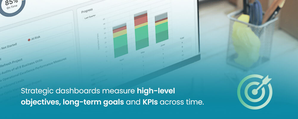
Strategic dashboards are distinct from operational and analytical dashboards. Operational boards track daily activities, and analytical boards focus specifically on monitoring KPIs. Strategic dashboards measure high-level objectives, long-term goals and KPIs across time. They do this by consolidating information from:
- Human resource management systems (HRMSs)
- Financial databases
- Project management tools
- Application tracking systems (ATSs)
This data can then be used to:
- Monitor the progress your business has made toward strategic goals
- Identify business opportunities and potential areas for concern
- Facilitate informed decision-making
Choosing KPIs for Strategic Management Dashboards
The first step in creating an effective dashboard is deciding which KPIs to include. You can identify the most useful KPIs for your business by asking the following questions:
- Who will be using the dashboard?
- What is their level of data literacy?
- What decisions must they make regarding your business’s processes and future?
- What strategic questions does the dashboard need to answer to guide those decisions?
- What are your business’s long-term goals?
Many decision-makers find that collaborations and interviews reveal the answers to many of the questions above. Communicating with stakeholders who play a key role in facilitating your primary KPIs can be especially helpful.
Strategic KPI Dashboard Examples and Best Practices
The KPIs you choose to monitor via your dashboard are vital, as they give you a sense of where your business is and where it’s going. Displaying low-value KPIs can lead you and other stakeholders to make poor strategic decisions. Conversely, high-value KPIs can empower your decision-making and give you the data-driven insight you need to transform your business.
Effective strategic KPIs tend to be SMART:
- Specific: They are narrow in focus and can be separated from other pieces of data.
- Measurable: They can be represented and calculated numerically.
- Actionable: They can be directly affected by your business’s practices.
- Relevant: They are directly connected to your business’s long-term goals.
- Time-bound: They have a deadline or timeline that your business can meet or fail to meet.
You can narrow down your KPIs even further by avoiding vanity metrics — KPIs that look good on paper but provide no real insight into the business’s performance. For example, a manufacturing company likely does not need to keep the average customer service response time on its strategic dashboard, as it does not have to field calls the way an insurance company might.
Instead, focus on the most relevant leading and lagging metrics. These are areas where your business is either excelling or failing to live up to its potential. If a particular KPI is leading to heightened performance for your business, it’s essential to keep your eye on it and keep it high. Conversely, a low but important KPI represents an opportunity for more efficient business processes or more effective workplace policies.
Once you have identified KPIs that are SMART, leading or lagging, be prepared to make your case to the other stakeholders involved in your business’s decision-making. You should be able to draw correlations between your selected KPIs and the business’s progress toward its strategic goals. After all, the connection between the two is what makes a KPI worth tracking.
Best Practices for Effective Strategic Data Visualization
One of a strategic dashboard’s most impressive and useful features is its ability to display strategic data via graphs, charts and other data structures. Data visualization makes complex information understandable, reveals your business’s patterns and tells the story of your business’s performance.

However, you must choose which data gets the visual treatment within the dashboard. When it comes to design, the dashboard best practices include:
- Clarity and simplicity: Less is more when it comes to dashboard design. All visualized data should be straightforward and intuitive to understand so that it can be explained and acted on quickly.
- Accuracy: All data represented should be truthful and representative of the business’s authentic performance. Do not elevate minor metrics over KPIs or alter time frames to make data adhere to desired narratives, as these practices ultimately cause more problems than they solve.
- Efficiency: Visual data can convey complex concepts quickly, so leverage that strength. All data structures should be intuitive and accessible at a glance so that decisions can be made with agility and precision.
- Context: All data within the dashboard should connect to your business’s goals in some way, so be sure to provide relevant context for each data structure. This could be when new benchmarks are reached, when targets are met or performance trends that have appeared in the past.
- Aesthetics: Your strategic dashboard should be user-friendly and prioritize function over form. Keep the layout simple and readable while giving other users more control over what information is displayed. A crowded dashboard can make it difficult to prioritize or identify what’s truly important, so focus on the critical information and present it in the cleanest way possible.
Applying these principles can make your business’s data easier to understand and use and can increase your overall agility and strategic potential. You may even find that an effective, professional dashboard design fills stakeholders with confidence in the strategic moves being made.
Data Visualization Techniques for Strategic Insights
Once you’ve internalized the principles above, it’s time to decide what shape your visualized data should take. After all, a wide range of data structures can enhance the reporting and understanding of your business’s performance in unique ways, so the choice matters in a profound sense. Specific structures may also help you and other stakeholders answer long-term strategic questions that different structures cannot.
With that idea in mind, let’s take a look at some of the most common visualization types:
- Line charts: These structures allow you to track trends such as revenue growth and market penetration over time. Line charts are often used in the stock market and are one of the most popular data visualization types.
- Bar/column charts: These structures compare values across categories. For example, you might compare the performance of different regions or the profitability of various products side by side so you can shore up weaknesses or stop production on products that aren’t in demand.
- Scorecards/KPI widgets: These handy visuals display your key metrics relative to specific targets. They are a great way to keep track of your proximity to your business’s long-term goals in a simple, compact way.
- Gauges/bullet graphs: Similar to scorecards and KPI widgets, these graphs allow you to track how close you are to reaching a specific target. Where scorecards and KPI widgets display relationships, these graphs display progress by filling up over time, allowing you to track your numbers and view past milestones on the way to the goal.
- Scatter plots: These structures allow you to visualize and identify correlations between two variables via scattered data points. By leveraging and interpreting numerous pieces of data, they can help you and other stakeholders identify key trends in your business’s performance.
- Maps: Geographical data can be invaluable for companies invested in expansion. You can use the map to visualize regional performance, market density and other data to make strategic decisions about where to invest and grow your business.
- Pie/doughnut charts: While these charts tend to see less use than their counterparts, they can be helpful when examining part-to-whole relationships within a given category. For example, you might want to look into how much a particular product line contributes to overall profits.
Each visualization type has its own uses and ways of empowering your decision-making. However, don’t let their potential interfere with maintaining a clean and orderly dashboard. Data overload will cause far more problems than it solves, and you can always adjust the dashboard as necessary when looking for answers to specific strategic questions.
Best Dashboard Design Practices for Business Intelligence
Designing your strategic dashboard isn’t done once you’ve chosen your desired KPIs and data structures. You should consider some finer details to enhance the dashboard’s presentation and usability. Here are some of the most impactful strategic dashboard design principles for executives to focus on:
- Layout and organization: The dashboard should flow logically from KPI to KPI, adhering to a clear hierarchy that groups related information together. For instance, you might leverage a Z or F pattern to take advantage of how people tend to scan a page.
- Color usage: Color can help guide the eye to the most relevant parts of the dashboard. For example, give your most important data points extra emphasis through color. However, you should still keep things simple and accessible, so don’t lean too heavily on color-coding every piece of data. Focus on readability and usability instead.
- Typography: All fonts should be legible and appropriately sized for easy reading on all devices.
- Interactivity: Drill-downs, filters and tooltips can be extremely helpful if you’re looking for more detailed information. However, too many can muddy a strategic dashboard. Include them only where they’re most useful.
- Providing context: Your dashboard can leverage comparisons and annotations to contextualize visual data. For instance, you might compare quarterly earnings to your business’s yearly goal or the most successful quarter in the business’s history via an annotation. However you choose to use these contextual tools, ensure they are unobtrusive and relevant to your strategic decision-making.
- Minimizing clutter: Always ask yourself what you can remove from the dashboard. It’s easy for charts upon charts to pile up, but how many actually see regular use? If a particular metric has become unimportant or irrelevant, remove it from the dashboard to make everything else easier to use.
- Mobile responsiveness and accessibility: Simpler dashboards will be easier to use on mobile devices such as tablets and smartphones. By keeping your dashboard clean, you make it easier for all stakeholders to use, no matter where they are.
Common Pitfalls in Executive Dashboard Design
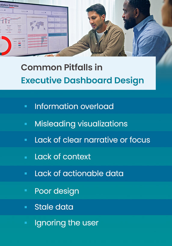
Many strategic dashboards are plagued by design problems that hinder strategic planning and decision-making. Some of the most common pitfalls these dashboards fall into are:
- Information overload: Many dashboards display too much data and too many metrics simultaneously, making it harder to extract meaning and value from them.
- Misleading visualizations: Some dashboard designers use charts that obscure information or intentionally mislead other stakeholders. Pay close attention to what they choose to emphasize to determine if the data is being manipulated.
- Lack of clear narrative or focus: Your dashboard’s data should tell your business’s story so you can decide its future. If it fails to do that, you may be focusing on the wrong data.
- Lack of context: All data in your dashboard should be contextualized. To do that, your business’s goals and targets need to be integrated into the dashboard. Otherwise, you will have no sense of your business’s progress.
- Lack of actionable data: Your dashboard’s data should provide insights you can act on. If your actions cannot change or influence the data, it likely does not belong on your dashboard. Making reporting dashboards actionable for leaders is then a matter of considering what metrics your business has the power to change.
- Poor design: Your dashboard must be intuitive and usable for all stakeholders and decision-makers. If it is cluttered, crowded or aesthetically unappealing, you may find that everyone has a harder time using it to make strategic decisions.
- Stale data: Many dashboards aren’t updated as consistently as they should be. To be useful, they must provide the latest data from reliable sources around your business.
- Ignoring the user: Some dashboard designers ignore their users’ needs. Before settling on a particular design, collaborate with your users to understand their needs and what will be most useful for them, both in terms of data and aesthetics.
Leveraging Strategic Dashboards for Iterative Improvement
Moving from data reporting to actionable business intelligence takes time, but remember, the dashboard is a tool, not the end goal. Once you’ve chosen a design, leverage the dashboard to support strategic review meetings and other decision-making processes.
It can lead to data-driven discussions and relevant questions while prompting action based on trends in the data and desired goals. These discussions can lay the groundwork for next steps and give you the needed insight to delegate responsibilities accordingly. They should also inform any changes you make to the dashboard in the future so it can better serve your business’s needs and changing strategic goals.
Reach Your Full Potential With Achievelt

Well-crafted strategic boards should bridge the gap between data and strategic action. If you’re already working with a dashboard, applying the principles above can transform it into the primary tool your business relies on for decision-making. However, if you haven’t taken the leap yet, Achievelt is the perfect partner for you. Our proprietary plan execution program puts the power in your hands so you can drive your business forward.
Request a demo today to start your journey!